I met Andy Katz a while back when he was assembling some paintings
in our local airport lobby. He was showing a collection of watercolor paintings
based on Nautical Art. I grew up on the Eastern Shore of Maryland where I spent
many Saturday mornings fishing off the shores of Tilghman Island moving through
the docks and landscapes loaded with Bay boats. I also spent some time in my
teens and twenties avoiding splinters at the end of a board on a Log Canoe.
Andy’s technique and close focus on the wood, metal, and rope that are so much
a part of this lifestyle evoked a strong response with me.
When I visited his website katzart.com he also had an extensive
body of work on sports figures that were not just portraits, but really
captured the time and place of the athletes. When he creates his paintings, he
seeks out the subject and has them sign the piece, creating a true
one-of-a-kind image.
Then came the hip-hop.
He has created some amazing portraits of hip-hop legends and
connected with many of them. My favorite is Questlove, but the Tom Morello is
awesome too. Andy recently had a one-man show “Two Paths—Experience as Art”
where he showcased his work and the subjects that inspire him.
Old Dog is about old-school artwork and New Tricks. Andy fits the
thesis to a T. He was willing to answer some questions.
Your
technique as an artist seems to be the common thread as you approach the
subjects you love. What inspires your point of view?
The common thread in my work is really that which I find visually
inspiring. I called my solo show “Two Paths”, as a result of what are seemingly
disparate themes—Hip-Hop and nautical imagery. I get the same jolt of
inspiration from witnessing a beautiful landscape, a rusty boat part, taking in
a live baseball game, or attending a live music show. When we observe our
surroundings, it can be very personal and intimate. My boat, bird, and crab paintings are my
attempts at capturing the way I interact with the visual world. I don’t always
see whole objects, choosing rather to investigate small sections or details.
The textures and colors of the nautical world on the eastern shore make me want
to paint. While I work from photographs of my favorite athletes and Hip-Hop
artists, the feeling of inspiration is the same. I leave the ballpark or the
music venue, wanting to capture the sights and sounds that attracted me in the
first place.
What
visual artists inspire your work?
I find inspiration in a wide variety of visual artists. Favorites
include, but are not limited to, Edward Hopper, NC Wyeth, Chuck Close, Keith
Haring, John Singer Sargent, Joseph Cornell, Winslow Homer, Johannes Vermeer,
Georgia O’Keeffe, Paul Cezanne, and Andy Goldsworthy. I’m fascinated by recent
studies that imply that Vermeer used optics in the completion of his
masterworks. In my opinion, his marriage of science and construction of
composition sets his work apart, even as it’s criticized by purists. His vision, and ability to capture the mood
and feel of a specific era is undeniable. Someone like Keith Haring seemingly
invented his own visual language. It’s inspiring to see how he connected his
imagery to pop culture and his urban surroundings.
You
clearly are connected to Hip Hop. Is there any other style of music that you
are equally passionate about?
I really love music of all types.
Music has a way of elevating an experience, and perhaps making it more
memorable. My favorite music makes me
feel and remember. Songs that evoke personal recollections are the catalyst for
my Hip-Hop portraiture. These pieces
have me harkening back to a transformative time in my life. The songs can
motivate, empower, and connect people.
Bob Seger songs make me want to take a road trip, while classic tracks
by Public Enemy encourage me to get involved politically. A well-written song can generate incredible
empathy. If you’re lucky, you’re able to learn something, and you’re able to
take on new perspectives.
As
a teacher, how do you connect with young artists and inspire them?
I think I became a teacher because of my middle school visual arts
experience. It was a difficult time for me, as my father passed away when I was
eleven years old. Just when I began
asking sophisticated questions and trying to figure out my place in the world,
I was left to my own devices. It was Art that gave me purpose and provided the
positive reinforcement that I needed. It became apparent that I wanted to offer
that same safe place for young people. Becoming a middle school art teacher
afforded me an opportunity to pay it forward, while making it possible to
continue making my own art. When I design a lesson or a unit of study, I often
ask myself, “What would I want to do if I was in a middle school art class
again?” This question, more than any
other, keeps me abreast of pop culture, trends in education, and the overlap
between traditional techniques and pedagogy and cutting edge, exciting approaches
to making art. As a result, my 7th Grade students participate in a
guitar design challenge and, in 8th Grade, they present new ideas in
footwear. They are encouraged to think like professional artists, as we focus
more on problem-solving and innovation, rather than on how well they draw. Our
goal is to have them being artful in academic classes and in other aspects of
their life.
What
is your “why?” What makes you paint and draw?
Keith Haring said, “The best reason to paint is that there is no
reason to paint.” I find that to be true. If I have a commission, or I’m taking
on a project that keeps me busy for long periods of time, that can be
gratifying, too. I find, however, that it’s when I’m just compelled to paint or
draw, that I enjoy it the most. I’m sure it goes back to middle school for me.
It’s after you generate a new work; you want to share it with people. You want
that feedback, dialogue, and interaction. Art gives me purpose, drive, and challenges
me to work on myself. I always want to get better, and when I’m making art I
feel like a student. It enables me to feel like I’m moving forward.
BTW,
your drawing skills are off the charts! And the use of corrugated cardboard as
a substrate for the hip hop portraits is spot on. What made you connect the
subject and approach?
Back in college, several painting students I knew forged
relationships with appliance stores. When the stores sold refrigerators,
washers and dryers, etc., the students would acquire the large, discarded,
cardboard, boxes. As a result, they
would have a semesters-worth of drawing/painting surfaces. This was certainly cheaper, and more
efficient than stretching a canvas, or buying expensive handmade papers. As a bonus, the corrugated cardboard, has an
aesthetically pleasing texture, and it can be ripped, cut, bent, and scored.
The surface accepts many different media, and the brown color is a beautiful
medium tone that allows the artist to work with black and white. When I started playing with it, I loved using
the white charcoal to carve in the highlights. I’ve started to cut into the
surface to reveal the corrugation underneath the top layer of brown paper. In
this way, I’m able to expose texture, and use an X-Acto knife as a drawing
tool. I’m excited about this discovery, and I have plans to investigate the
potential of this approach.
Other
than stacking rocks…what’s next? What subject do you think you will dive into
next?
In the near future, I see myself working with the Hip-Hop
community. Through my art, and meeting
many of my Hip-Hop heroes, I’ve been able to network and connect with the music
world. The relationship has become
symbiotic, and I hope to generate artwork that supports live music, while
providing a visual experience that complements attending a live show. I didn’t
really see this coming, so I’m not sure what I’ll dive into next. Recently, I have been experimenting with
digital approaches to drawing and painting.
I just completed a draft of a children’s book for the Clevelend Clinic
in Ohio. All twenty images in the story
were constructed on an iPad mini, using the Procreate app. It’s a brave new world, and I’m just trying
to keep trying new things.
(The Old Dog loves new
tricks—need to explore this DM)
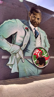
What
challenges did you encounter when you worked on the DC mural? And how did you
overcome them.
The mural experience was an incredible learning opportunity. All of the artists who came together on that
project were experienced graffiti writers.
They knew all the ins and outs of painting with aerosol, outside, in the
elements. I did all of the concept drawings and watercolors. The whole mural
was planned out in miniature. While I did draw it all out, the fabrication was
painted by a team of artists. Initially, I was included because I had been
experimenting with technology and the interactivity of artworks. After seeing a
compelling presentation for art teachers on augmented reality and image
recognition software, I started to use the app Aurasma to make some of my
artwork interactive. You can use a phone or device to reveal hidden video,
photographs, or other digital content, when you scan the two-dimensional
imagery. It was thought that this could
make a mural truly unique. As a result,
after we completed the mural, we identified eleven sections that would become
interactive. When you view the mural,
you can reveal songs, video footage, and spoken-word poetry. The team that I worked with, made sure I had
a hand in painting each section of the mural, that I experimented with aerosol,
and worked on an irregular surface. In the end, I felt a great sense of
accomplishment and I visit the wall at 1351 U Street in DC often. It was truly
a collabarative work, and I feel very fortunate to have been involved.
Can
you share some of your process?
My process varies depending on what I’m doing. If I’m painting a
landscape, I prefer to paint outside. In
that way, my approach is very traditional – drawing on a watercolor block, and
using a small set of paints to get me through.
When I paint in the studio, I spend a lot more time on drawing. For me, the
success of a composition rests in the drawing I do before I’ve added any paint.
When I first used watercolor, I was frustratingly unsuccessful. I was trying to
emulate artists who were very fluid and loose in their approach. As a result, I made very muddy, uncontrolled
washes, and gave up for many years. It
wasn’t until I allowed myself to complete a detailed preliminary drawing first,
that I had any confidence in my ability to manipulate the paint. Although it was contrary to many of the
techniques I had been taught, I found a methodical and enjoyable approach to
controlled watercolor painting. It’s now my favorite medium.
What are some of your favorite works?
My Questlove painting is probably my best painting from a
technical standpoint. I’m happy with the realism, and the treatment of the
different textures. This piece also represents a leap forward for me. Instead
of making a straight copy from a photo, I managed to generate a surreal quality
by adding the tree roots to the torso. I
hope to build on this idea in the future.
The large cardboard Rakim drawing is also among my favorites. When I’m done drawing, I bring these pieces
to live shows. I consider it finished, if I can convince the subject to write
lyrics on the work. In this case, Rakim tagged lyrics to the classic song Microphone
Fiend. This piece epitomizes my goal and represents the process from
start to finish.

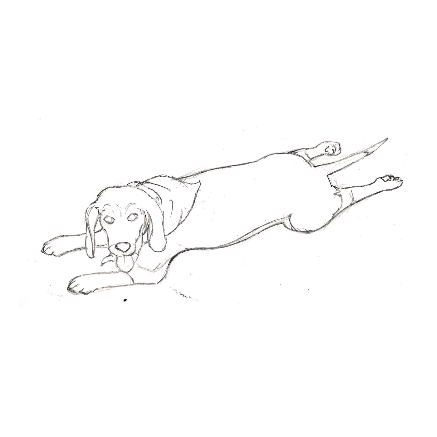
 About 20 years ago, my Mom wrote a children's book about our dog Sadie. It sat in a file cabinet until just before her 80th birthday. I knew it was there and hoped to get to it, but it would always go dim on my radar. I made a commitment to illustrating, designing, and publishing it and started the process. I did preliminary sketches in time for her 80th birthday and got the ball rolling.